N’OWL
Sample Staging
Discipline
Brand Identity, Graphic Design
Timeline
January 2023 - April 2023
Brand Vision and Mission
Tools
Illustrator, Photoshop, Figma
Striving to be a hub for young creatives everywhere, N’owl is the ideal innovative space for both work and play. Our late-night coffee shop and
co-working space are designed to promote collaboration, creativity, and openness, and we strive to maintain a culture of respect and inclusivity.
Whether you're working on a project, meeting with friends, or simply enjoying a cup of coffee, N'owl is the perfect place to be.
Join us in celebrating the power of creativity and community – we can't wait to see what you'll create.
Typographic Logo / Wordmark Mascot Logos
Brand Rationale
When I was given free rein to create a brand from scratch, the first idea that came to mind was a late-night coffee shop, as it is something that my friends and I discuss frequently. Thus, my intention was to appeal to both a need for community, and a need for inspiration that so many of us are lacking nowadays. While creativity is essential for personal and professional growth, it's not always easy to find inspiration. I wanted N'owl to offer an environment that stimulates invention and encourages people to explore their passions.
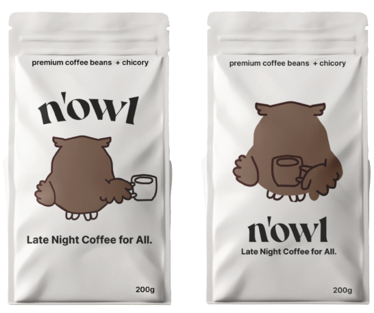
My mascot logo aimed to create a welcoming and approachable space to do just that, with soft browns and smooth lines emphasizing the fact that collaboration and coffee should be accessible and not intimidating. The playful logo but mature colours increase the brand’s target audience from just students, to even young adults and adults. This is emphasized by my brand’s slogan. Further, through the amalgamation of the serif font and lowercase logo, I aimed to establish my brand positionality as professional, but still playful. For brand assets, I decided to create coffee packaging to reinforce the idea that inspiration can be found anywhere, even in the comfort of one’s home. Overall, I think all the elements of my project came together to convey a cohesive brand identity.
Personal Reflection
Working on each step of my project allowed me to gain a holistic and in-depth insight into all of the aspects that go into creating a cohesive brand identity. In the past, I had focused more on smaller-scale items such as a logo or copy for social media. However, this project really made me think about the larger picture of how each element slots together to ultimately portray a strong mission and emphasize its values through visual cues.
Initially, I was not very confident about my drawing/mascot-creating abilities, so I took it as a challenge to create a somewhat pleasing character as the central focus of my brand. At the end of the day, I’m extremely pleased with how my mascot logo turned out, which only reinforced the idea that the realms of possibilities in graphic design are endless. Overall, this project has given me such respect for brand identity, and I’m really excited to apply my newfound learning to new projects!


